There is not a single image on this page. Everything is done with CSS gradients, shadows, transparent colors and rounded borders. Looks best in Opera. If the background is red, you are using a “wrong” web browser.
background-image:
  repeating-linear-gradient(15deg, /* Big vertical shadows */
    transparent,
    black,
    transparent 1024px),
  repeating-linear-gradient(60deg, /* Tiny hatching */
    transparent,
    rgba(0, 0, 0, 0.25) 3px,
    transparent 4px),
  repeating-linear-gradient(105deg, /* Horizontal cuts */
    black,
    transparent 4px,
    transparent 224px,
    rgb(10, 0, 0) 256px),
  repeating-linear-gradient(15deg, /* Main layer */
    black,
    #334 1px,
    #CDD 15px,
    #999 16px,
    black 32px);
Please note that you need to repeat this for every web browser, with -o- for Opera, -moz- for Firefox and other Gecko based web browsers, -webkit- for Safari and Chrome and finally -ms- for Internet Explorer 10.
Things learned:
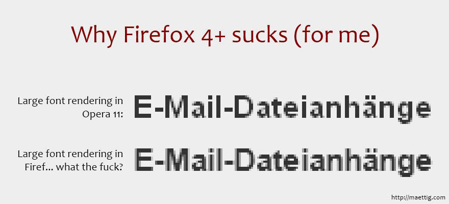
white, transparent gradient is white in Opera but gray in Firefox. Use rgba instead of transparent to avoid this.black 4px, white 4px may look jaggy in Opera. This can be avoided by adding 1px, e. g. black 4px, white 5px.Read more about repeating-linear-gradient in the Mozilla Developer Network.
© Thiemo Mättig, created in September 2011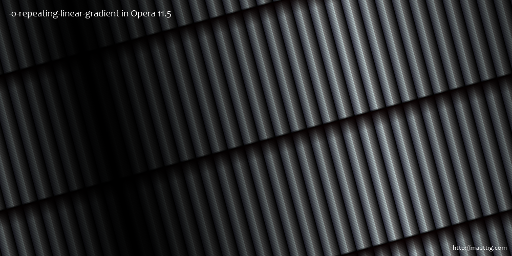